New values. Same gap to close.bridge the gap
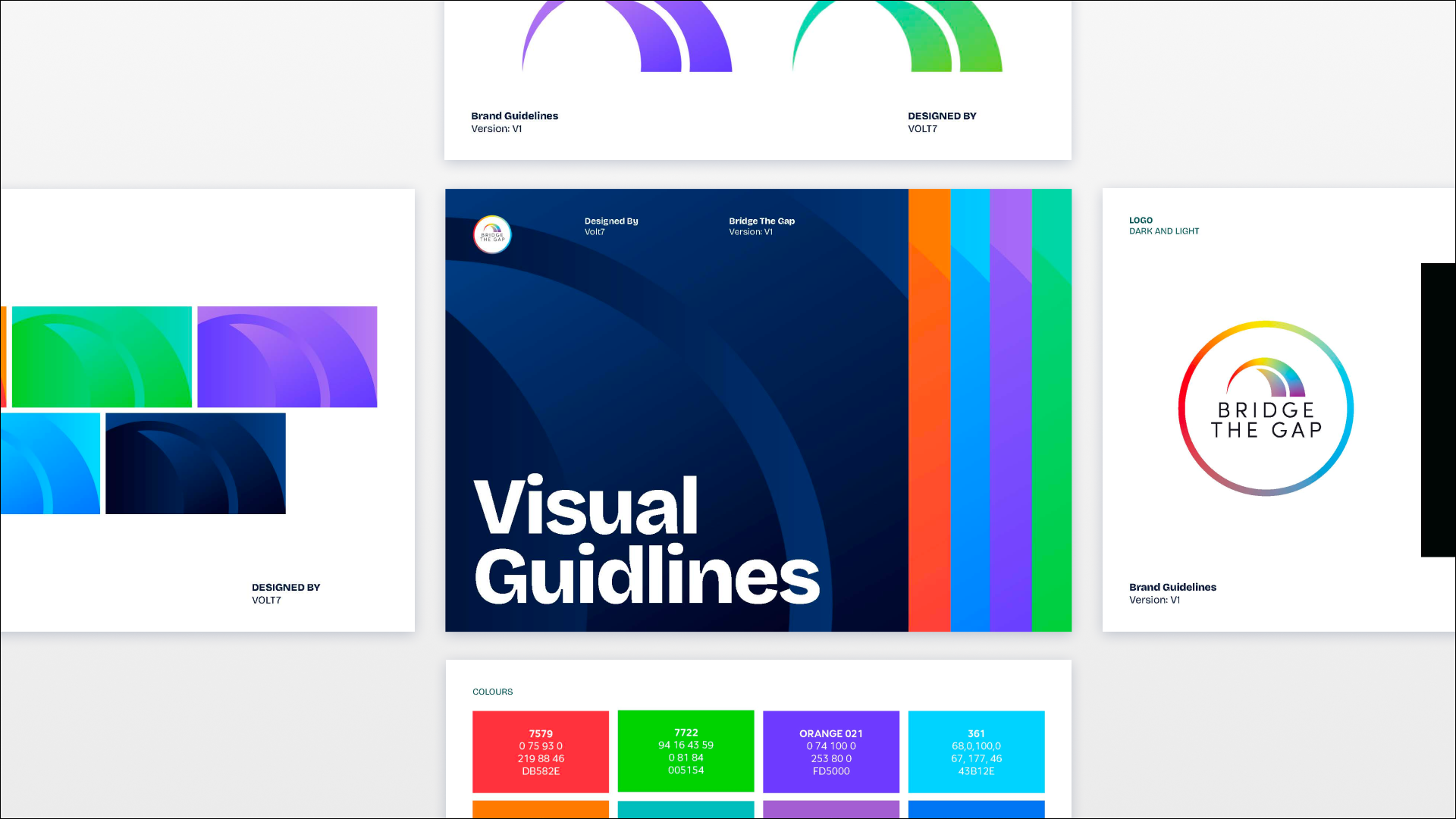
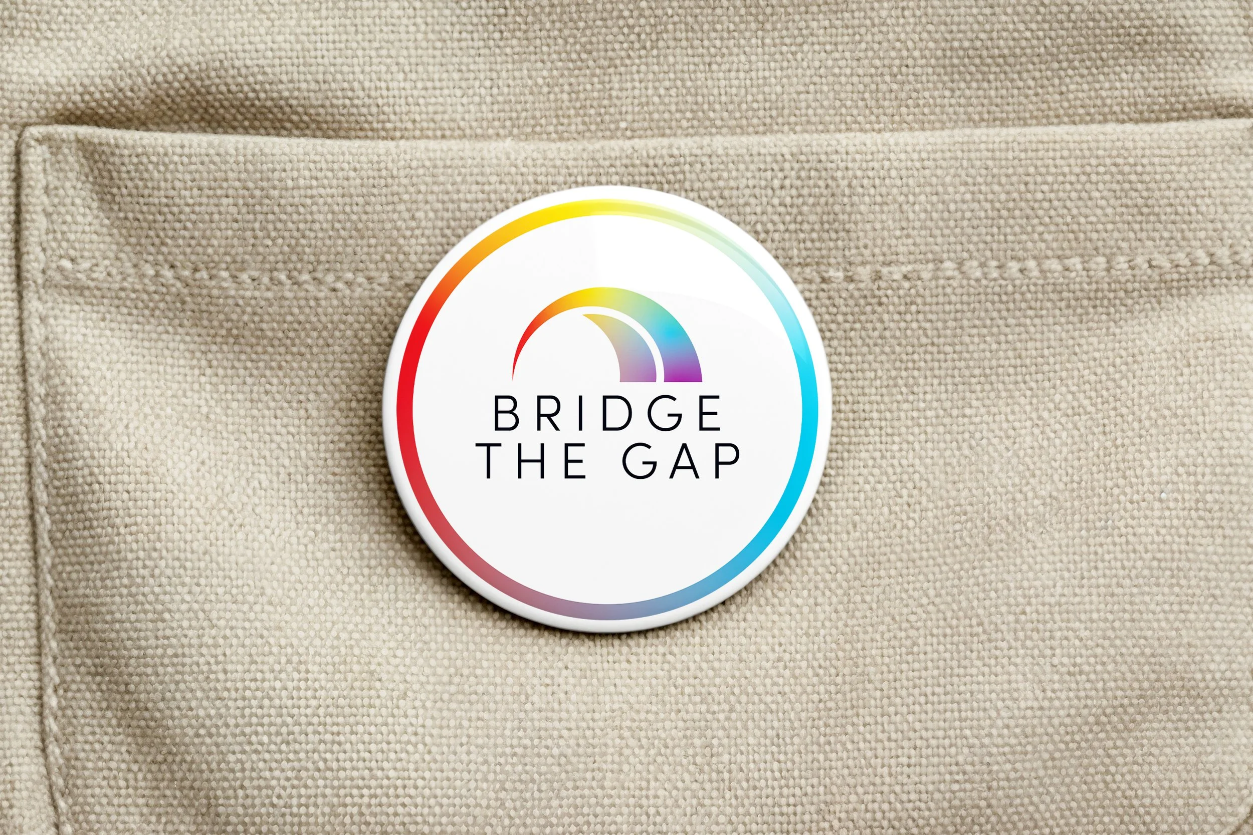
The work was always for children. The people who find it are parents and carers. We rebranded Bridge the Gap so both could belong, modern enough to feel current, with a nod to the heritage that earned trust from a deeply personal beginning. Approachability was paramount; it is how a mental-health CIC gets through the door when stigma still keeps families outside.
New values and a clearer mission gave the organisation a foundation staff and volunteers could stand on. Identity research is consistent: people attach when a brand reflects who they already are and who they hope to be. The rebrand made that attachment possible, for the child in the picture, and for the adult holding it. More energy to help more people.